
A Visual History of Drywall and Extratone
Looking back on the early blunders that developed my brands’ identity.


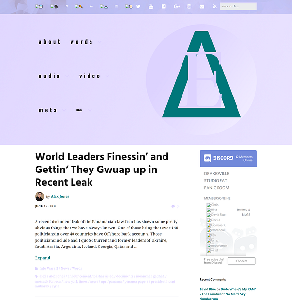
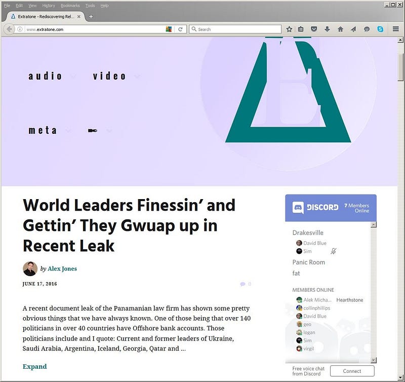
On May 18th, 2016, I launched Extratone as an independent online magazine to be filled with work from volunteer contributors but — quite crucially — I didn’t know anything about digital media or the web (despite assuming I already did,) so I needed to minimize the overhead of our platform both financially and architecturally as much as possible while still allowing it room to be visually compelling and typographically adaptive.
In the pursuit of frugality and ease-of-use, I managed to build The Extranet using exclusively open-source type properties into a platform that satisfactorily manifests the principle design philosophy which we agreed would best compliment our editorial mission, but it took a very long time and what seems like a huge fraction of my allotted life energy to get the site to where it is, now.
To celebrate once more, I collected as many images as I could from backups and I thought I’d indulge myself by taking a trip to the very beginning of what would eventually metamorphose into Extratone as it is today.
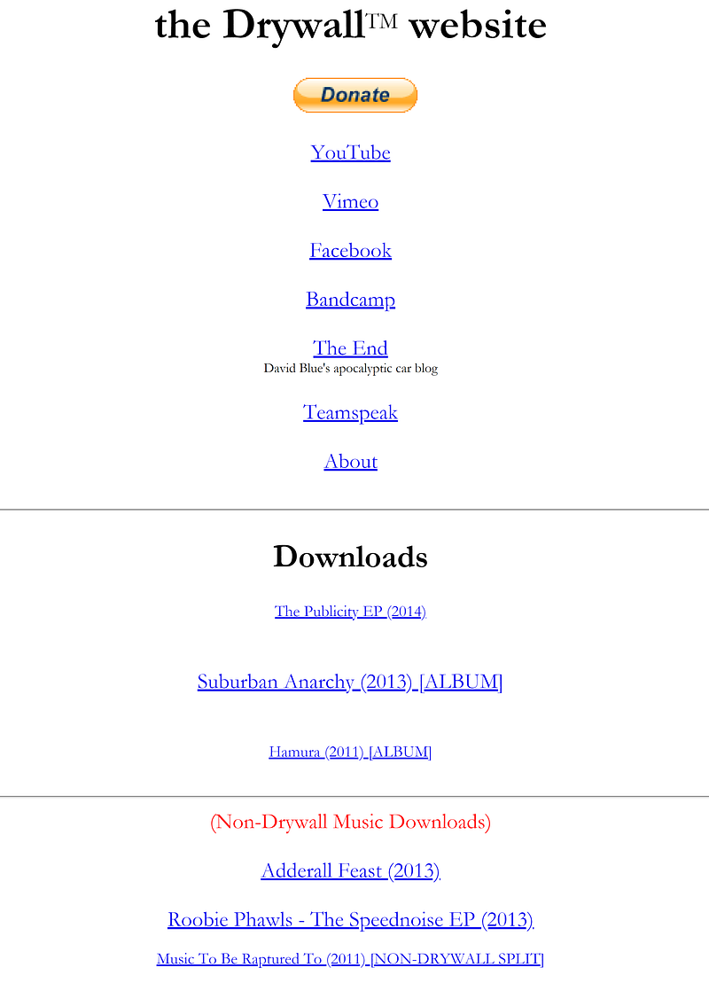
Drywall: 2011–2015
By the time my Junior year of High School came around, I was figuring to release tension in a big way that had built from my obsession since childhood when starting projects unsolicited by anyone or anything and slaving away to get it right. When I’d “vlogged” my experience as a student pilot the summer before, I would end up spending some 12–15 hours editing each (camcorder-shot) video because I didn’t have the experience or the technical knowledge to do it both right and speedily. This sort of behavior lends toward a pretty darn antisocial kid, as you might guess, but those strange friends of mine who were willing to keep me around would provide me a different perspective on “quality,” which I took to the extreme.
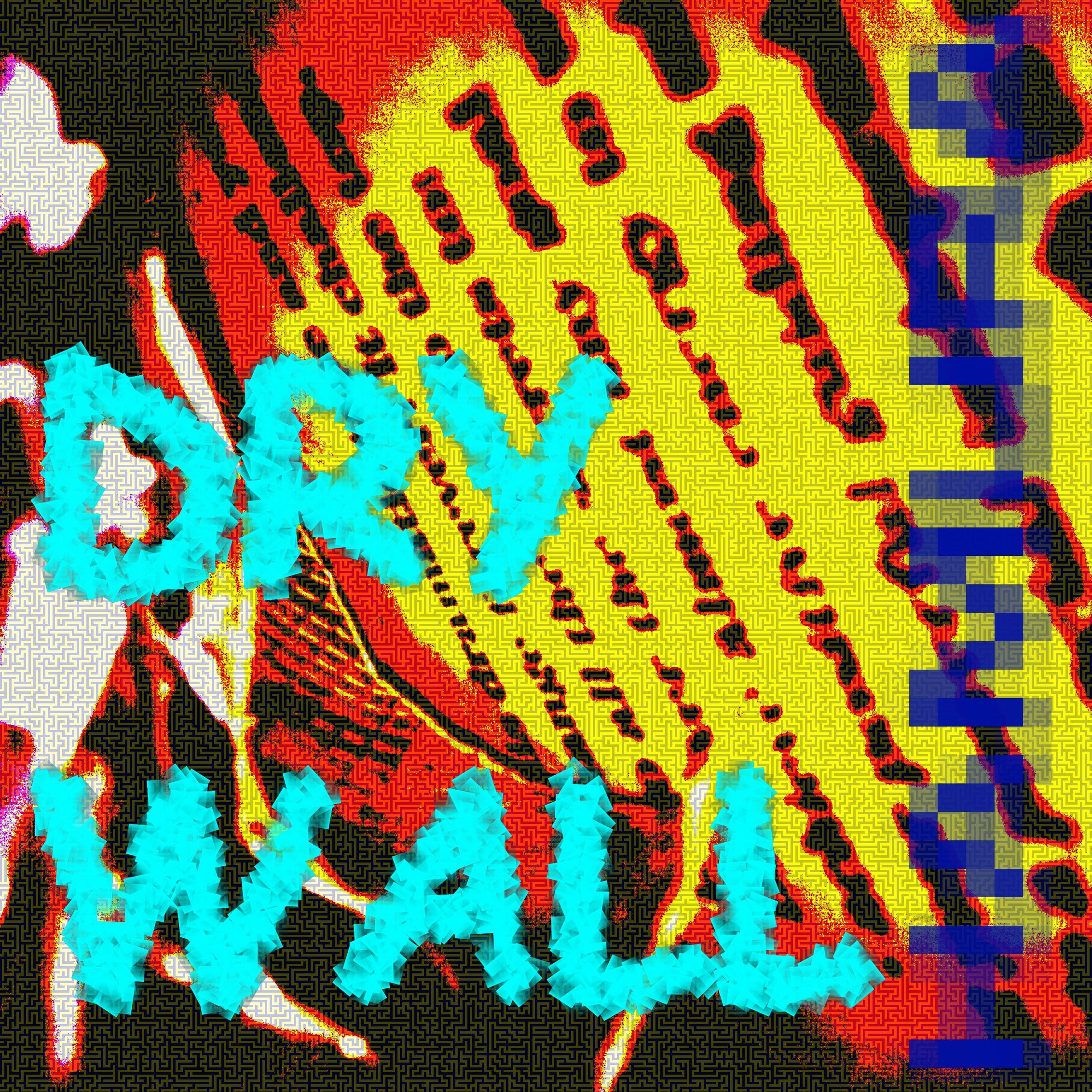
Of course, it’s hard to tell even less than 10 years after the fact what exactly I was feeling about this music, but I can declare with 100% certainty that Drywall — my noise tape-producing, sewer drain-dwelling, gasoline-drinking alter ego — was the whole of my adolescent rebellion with some branded art handily stuck on it.
As per the themes of the music and the YouTube videos, Drywall’s art was meant to be grotesque in more ways than are necessarily obvious in its through-and-through meaninglessness.
I think I really did as good of a job as any in an interview I did with a friend of mine about Children of the Corn 30 — what would definitely have been the pinnacle Drywall project had I not let it burn out for the sake of other pursuits.
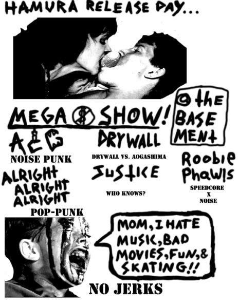
During the summer and fall of 2011, I recorded Hamura. The album itself features sounds of a treadmill, turn signal indicators, the sound of a VHS tape being repeatedly slid in and out of its case, an original, hand-made Native American 5-holed flute, and other nonsense. During the time, I was heavily influenced by the Columbia [Missouri] grind/punk scene (a lot of my friends were heavily involved in it,) in that I was trying to make angry-sounding ANTI-music that contained absolutely zero human emotion. I planned to record music that could have absolutely zero function as music. Children of the Corn 30 is a (matured) reflection of that mentality in the film medium. Key Parts of the Drywall alter (Drywall is actually a virtual band contained within the alter’s alter’s) included drinking gasoline, eating industrial waste, an obsession with clipping, and fear of sine waves and living in a storm drain surrounded by a pile of analog electronics. Around this time, my friends and I were “ironically” listening to noise tapes… The image of drywall involves a Thai Air Force jumpsuit, fairy wings, and obscure tribal instruments. In his storm drain, he records himself shrieking all day. If you wait outside the entrance long enough, a cassette containing these sounds will eventually fly out.
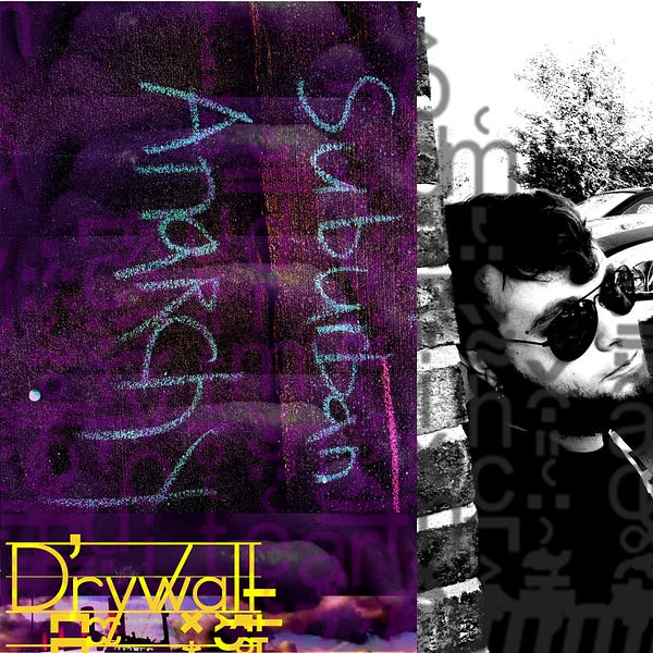
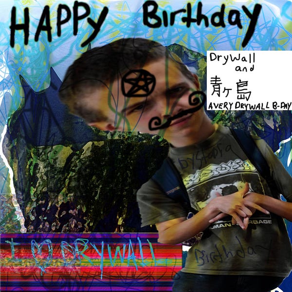
Art for the last (and best) Drywall album, Suburban Anarchy, as well as a friend’s personal birthday EP.
Version 1.0
Body and meta text both use Christian Thalmann’s versatile Cormorant family, which also often function in larger roles. (E.g. the About page shown.)
Frontpage titles, bylines, and all main navigation use Claus Eggers Sørensen’s open-source Playfair Display of varying weights.
Headings, section titles, and the header’s oversized central mast use 2 variations of Fabian De Smet’s Butler — Regular weight and Stencil, respectively.
Impallari Type’s Quattrocento Sans is used for the footer’s links to legal documentation and occasionally for pull-quotes, where appropriate.